
There are numerous factors which make a certain text readable, and even more reasons why that happens. Some adopted text forming factors (design or breaks) ensure its economy and legibility.
Reading process does not consist of only mentally translating signs into letters, letters into words and words into sentences to which we then cognitively add context and meaning. It is a process which requires focus, something an average reader can keep it only for a certain period of time, even in ideal conditions.
Apart from quality, clarity and concise content, reader’s focus can successfully be kept with a harmonic text structure. This is where we come to shaping as an important factor of legibility. Text is structured into titles, subtitles and quotes according to meaning and context thus achieving better understanding of the content.
Number of characters per text line
Legibility should not be a secondary item arising from design. It should be imperative as a mean of functionality.

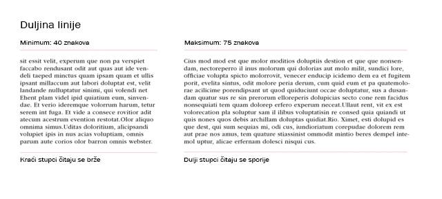
Optimal line length of a text according to numerous sources is between 50 and 75 characters per line. This number includes spaces as well. These are the numbers which are agreed upon by numerous professionals in typography, graphic and web design, and publishing. Deviation from this “golden measure” can have two main disadvantages as a result:
Too wide line – if the number of characters per line is way above the mentioned numbers, the reader loses focus. It is difficult to pass to the next line. Furthermore, valuable attention is often spent on guessing which is the next line. Therefore, reading process is fluid only when automated, almost spontaneous.
Too narrow line – when the line is to narrow the reader strains himself because that formulation means a chaotic reading rhythm and undesired skipping into a new line before mentally overcoming the current one. All of this causes tiredness and distances the reader from understanding the text or even the reading it.
Breaking text into lines is inevitable due to the functionality of the media it finds itself in, human anatomy and psychology. Only because of these fundamental reasons does typography deal with questions like number of characters in text lines.

How to achieve ideal length of a text line?
Optimal number of signs will be best controlled by limiting text width in pixels while respecting the composition for which you believe will be successful for your current project. Minor deviations from the mentioned 50 to 75 signs will not substantially impact the functionality of your design. It would be much worse to make exceptions in the accepted aesthetics and construction by changing arranged relations of visual elements – everything which leaves a stronger impression on the viewer in the visual sphere than other factors.
You will often successfully solve this problem by revising font size or adjusting kerning – the space between certain signs. This is why it is important to try several styles and compositions in the beginning.
Break the text
If your deviations are big, especially if you have too many signs in a line, you could divide the text into two columns or even more. You can find a good example of this in numerous magazines and newspapers. They use similar methods while trying to overcome the same problems.

Another challenge for designers is viewing of web pages on smartphones. The layout and size of visual elements usually vary for each platform which is why a responsive web is essential. This definitely entails handling text.
Test your solutions, ask your colleagues or professionals for advice and occasionally go back to previous steps of a project. This way you can help yourself achieve desired results and provide a positive user experience for your client and users.


